The Central Avenue Jazz Festival logo was a project I was honored to have been hired to produce. It was a great pleasure to work on and develop a design that pays tribute to the history of the legendary Los Angeles community where the festival has taken place for almost 30 years.
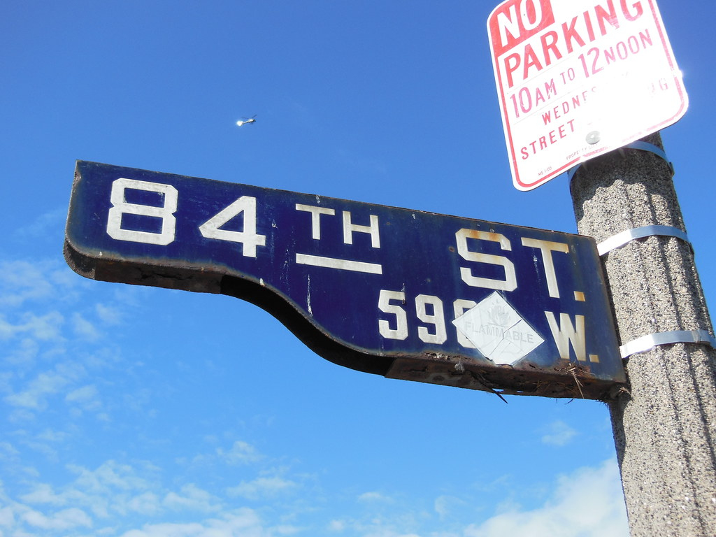
I was tremendously enthused to be asked to develop a logo for this project. With the street being the ‘central’ part of the name and inspiration for the Los Angeles festival, I thought it would be great if there was a cool way to incorporate the signage into the design for the logo. So in doing research for the design, I looked at dozens of photos of the area from the legendary jazz history of the street, during which giants like Dizzy Gillespie, Cab Calloway, and many others roamed the area. In combing through the images, I was looking for iconic symbols of the street during this era. It was the unique shape of street signs of this period that stood out to me.
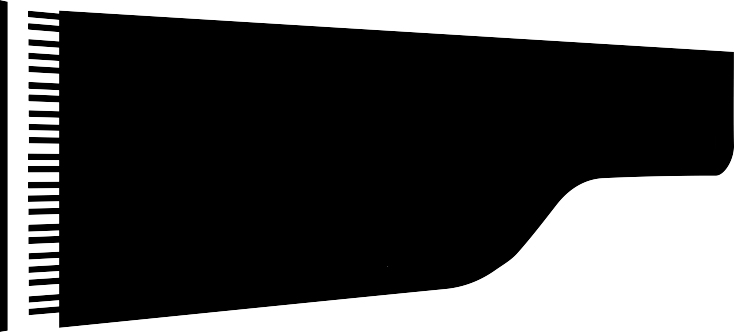
Because of their unique shape, they came to be known as “Shotgun signs” and they were pretty unique to Los Angeles. (Check out this video on shotgun signs. The history is pretty interesting.) To my eye, the curve under-shape of the design resembled the “bentside” curve of a piano:
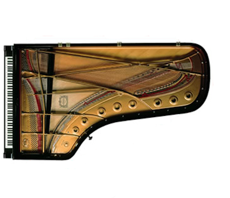
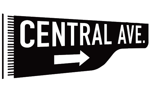
So I decided to incorporate the piano into a representation of a street sign in my concept. Here’s an early iteration of that concept:
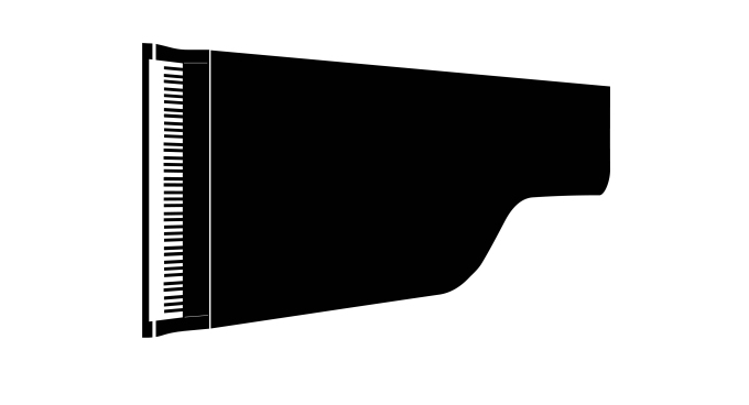
Moving forward I began refining the piano part of the design:
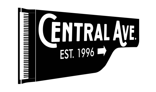
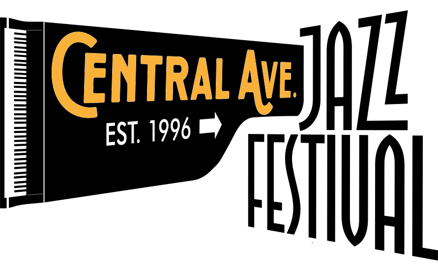
After experimenting with several fonts to add to the design, the client and I agreed on this one:
I then added the “Jazz Festival” text at an angle to balance the design:
In the first photo, there’s a bird nest built into the sign, which apparently was fairly common, so I thought it would be cool to “put a bird on it” (A Portlandia reference):
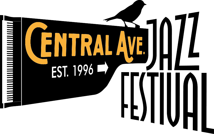
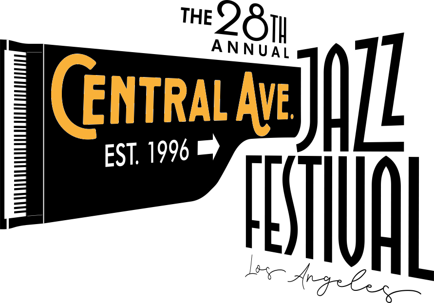
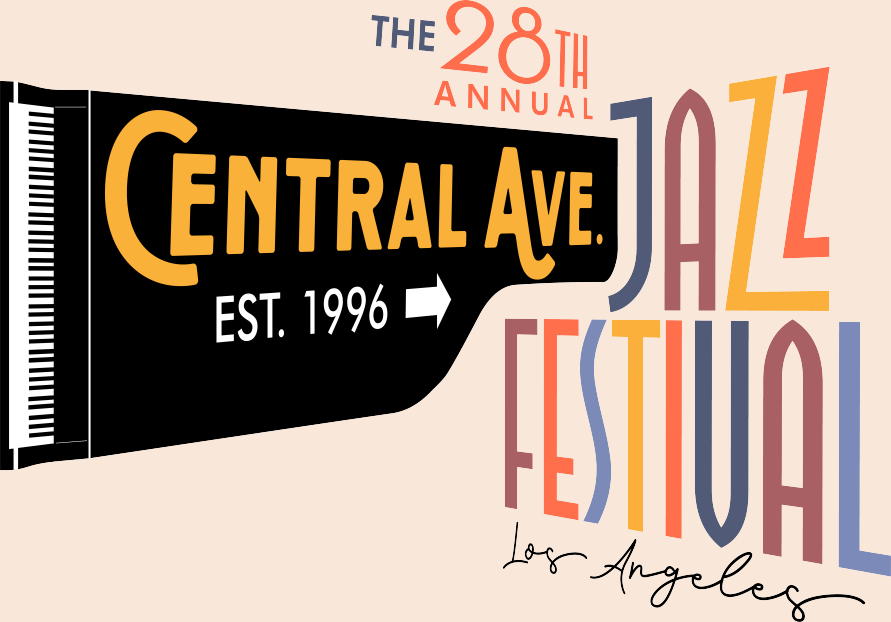
The client, however, was not really digging the bird, so I thought it would be good to replace it with “The 28th Annual” to commemorate the anniversary of the Festival, especially with this being the first in-person event since the pandemic:
I wanted to show how the design could be used with color textures in this example:
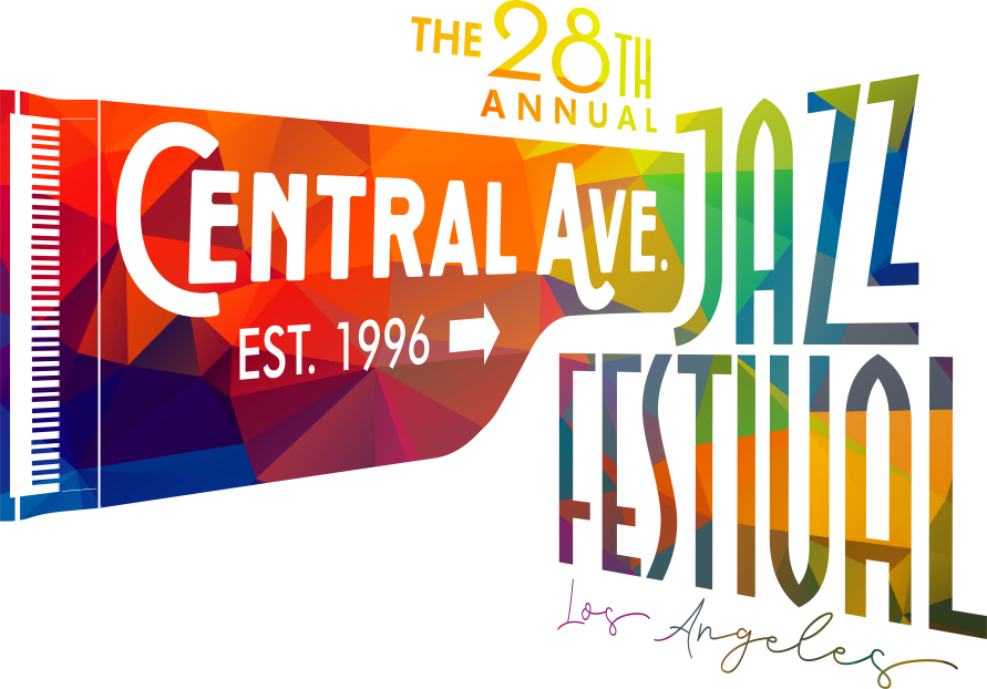
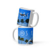
The client thought it would be good to use multiple colors for the letters in the final version after the design was submitted, so here is the final logo:
I’m really pleased with the finished product. Check it out it here in a highlight video for this year’s festival, which I attended on September 23rd, and thoroughly enjoyed! I’m honored to have contributed to in my own way with the opportunity to develop the logo and this year’s poster art. Long live the Central Avenue Jazz Festival!