When I was contacted by Andrea Greene, director of the Central Avenue Jazz Festival about the possibility of creating art for the 2023 CAJF poster and collateral materials, I did not know what a cool project it would turn into and how it might become a collaborative effort with another artist as well.
Early on in the process, Andrea was nice enough to send me tons of research material on the history of the festival and information on the history of jazz in the particular area of Los Angeles where the festival happens each year.
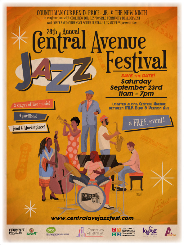
Learning about the wonderful history of the festival excited me and made me a bit nervous at the same time. I wanted to make sure that I could deliver something that honored this musical series and this region as best as possible. Andrea gave me a very clear idea of what she did and did not want in terms of the direction of the art. She definitely wanted an image that paid homage to Los Angeles’ great jazz legacy, but also something that conveyed that the music was very much an art form of today through younger musicians.
In developing a concept for the artwork, I knew that I wanted to convey the idea that jazz is very much a ‘group project’ and that it is a music that crossed generations of players and listeners, alike. I initially started with the idea of doing something in a more realistic form of illustration I had become aware of the work of artist/illustrator Martina Ardissono, who is based in Argentina. I thought Martina’s style would add something to the concept I had in mind, so I contacted and hired her.
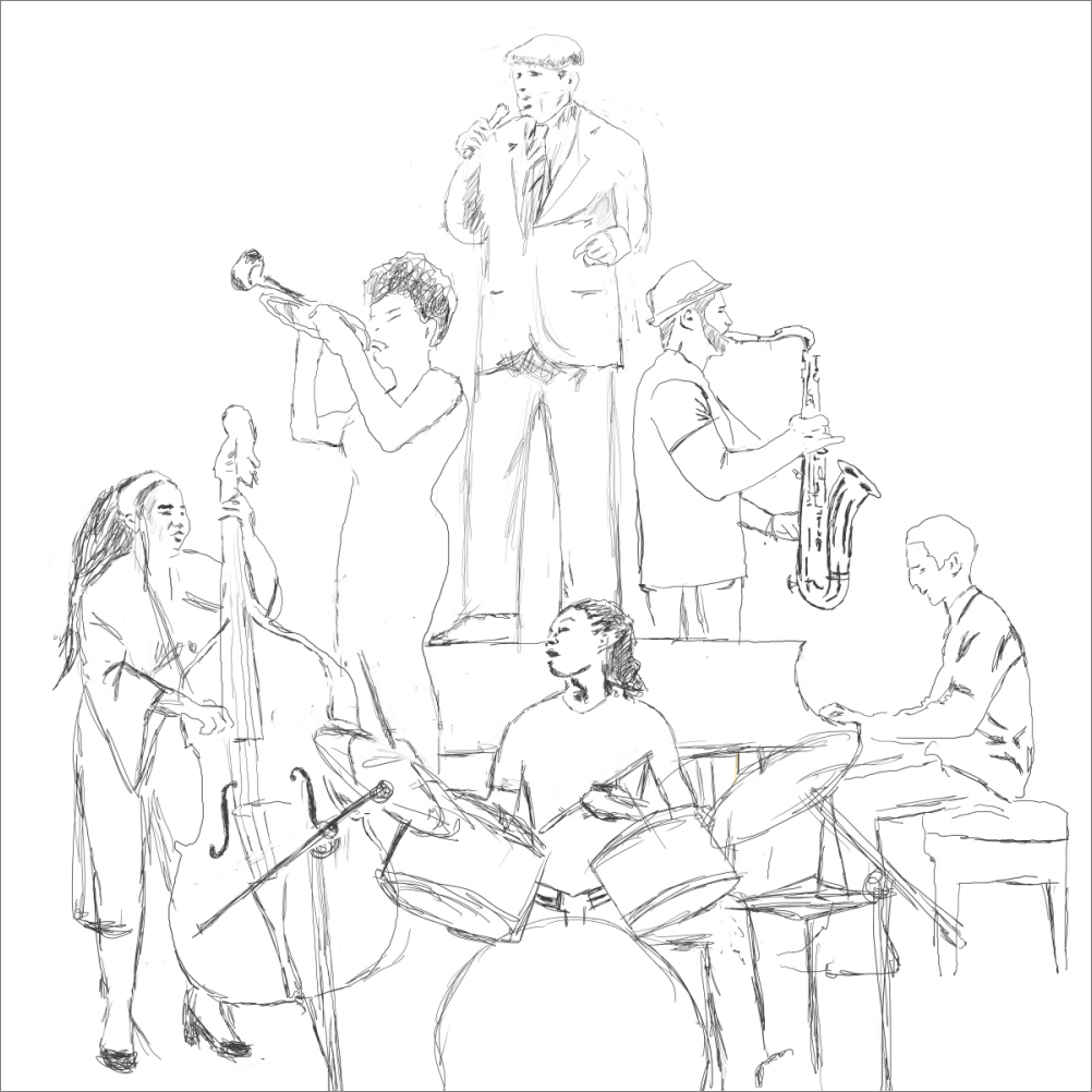
The first sketch I sent Martina was a bit generic, with rather generic musicians, but after a conversation with Andrea, I decided to refine it a bit more than the original sketch and include her idea of adding representations of two of the festivals recently departed stalwarts, singer Ernie Andrews and ground-breaking trumpet player Clora Bryant. So I modeled the male singer on Mr. Andrews in my updated sketch and the trumpeter on Ms. Bryant. I then sent it off to Martina to translate my sketch below in her own visual language:
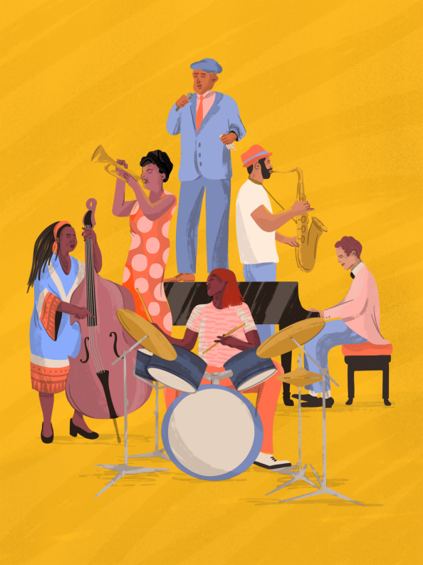
I was truly pleased with Martina’s colorful take on the sketch (which is seen below) I thought she would do a fantastic job and she delivered. I sent her the hex code for the bright gold color background because I associated that color with the skies at sunset that I saw in pictures of LA and I wanted to give the poster a bright feeling, rather than the darker vibes that are often seen in jazz festival posters. I really stayed out of the choice of colors and patterns of the players’ clothing because I really liked what Martina had done with those in other work of hers that I had seen. She did not disappoint.
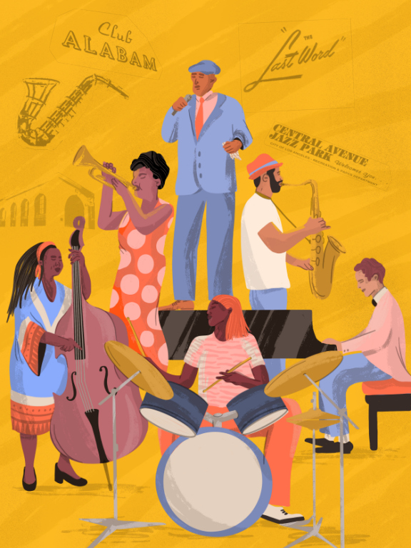
After requesting some minor tweaks, here and there, we ended with a nice piece of art. One of the things Andrea and I had also discussed was the possibility of including graphic representations of some of the historic marquees from the Central Avenue area, so I added some of those in the example below:
The graphic designer who added the event details and for the final version deviates slightly in terms of how the art fits within the poster from the above, but still looks good.
With the artwork completed, I moved on to my other part of the project, which was designing a logo for the festival.